New plan migration experience
Simplicity Plan Change
Designing a clear migration experience that reached a 14.4% plan-to-order conversion rate in its first month.
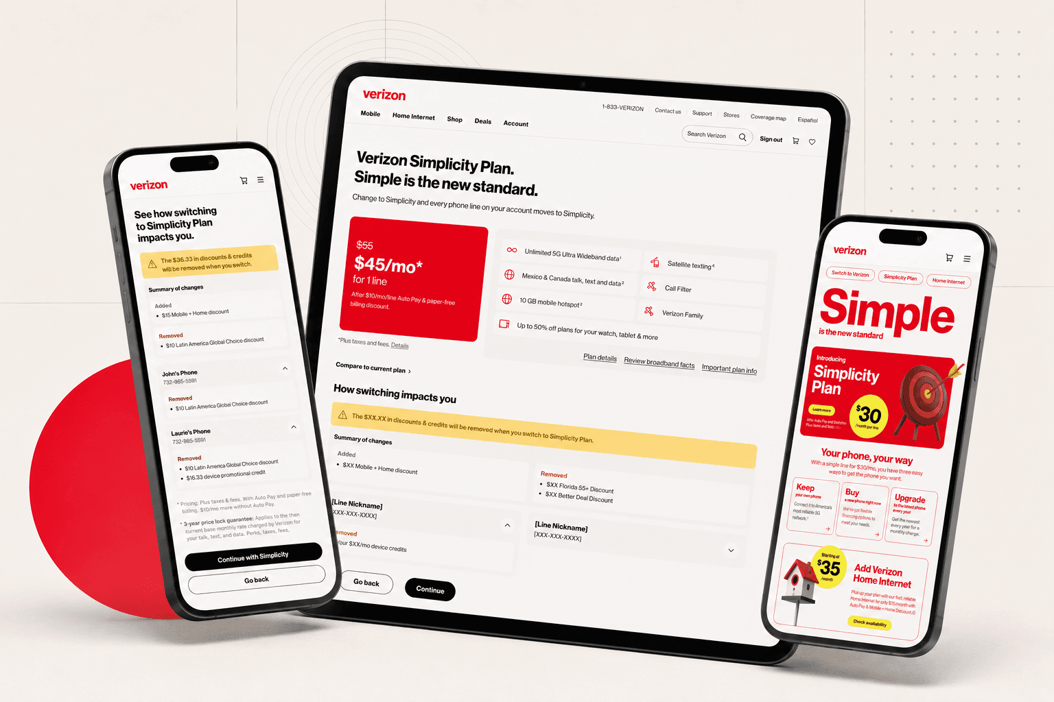
Overview
Role
Product / Experience Designer
Timeline
March – July 2026
Team
Product Manager, Engineering, Legal, Business Owners, Content Strategist, Research
Designing the plan migration experience for Verizon’s new Simplicity plan
Verizon introduced Simplicity to consolidate an increasingly fragmented wireless portfolio around a clearer, more flexible pricing model. During the initial launch phase, Simplicity was made available to both new customers and existing customers initiating a plan change. For existing customers, the experience needed to clearly explain how switching would affect monthly costs, discount eligibility, and current features before they completed a change that would prevent them from returning to their previous plan.
Project approach
01
Define the scope
Aligned with business partners on launch objectives, migration rules, and success measures.
02
Translate requirements
Worked daily with the plan-change product managers to turn evolving business rules into experience requirements and account scenarios.
03
Explore and validate
Developed initial concepts, gathered cross-functional feedback, and evaluated technical feasibility with engineering.
04
Lead and refine
Led another designer from wireframes through high fidelity, aligned adjacent Simplicity funnels around shared patterns, and resolved design, business, and technical feedback.
05
Support implementation
Partnered with engineering throughout the build and conducted visual QA to ensure critical account-change details were implemented accurately.
06
Launch and learn
Launched in late June and used first-month funnel data to identify priority improvements for MVP2.
Problem
Defining the experience as business and technical requirements evolved
Simplicity differed from Verizon’s previous plan offerings. Previous plans bundled features and add-ons together, while Simplicity separated the base wireless plan from optional features and services customers could add over time. For existing customers, switching could change discount eligibility or remove features such as unlimited hotspot, making those tradeoffs important to understand before completing the change.
Many of the business requirements were still being defined when the project began and continued to evolve throughout the design process. The backend systems needed to support discounts and perk bundles within Simplicity’s new structure were also still in development.
With only a few months until launch, I worked closely with business stakeholders and engineering partners to build alignment, resolve feasibility constraints, and move the experience into implementation.
Brand experience principles
Meaningful
Simple
Focused the experience on the information customers needed to make a confident plan-change decision.
Human
Supportive
Guided customers through the migration by clearly explaining how each change would affect their account.
Responsible
Honest
Avoided dark patterns by surfacing potential discount, promotion, and feature losses before customers confirmed the change.
Core flows
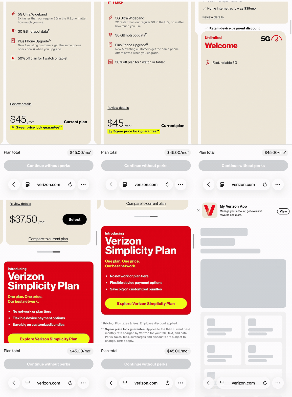
Simplicity Plan selection
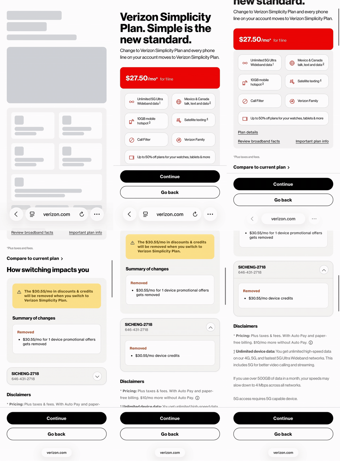
Simplicity details and migration impact
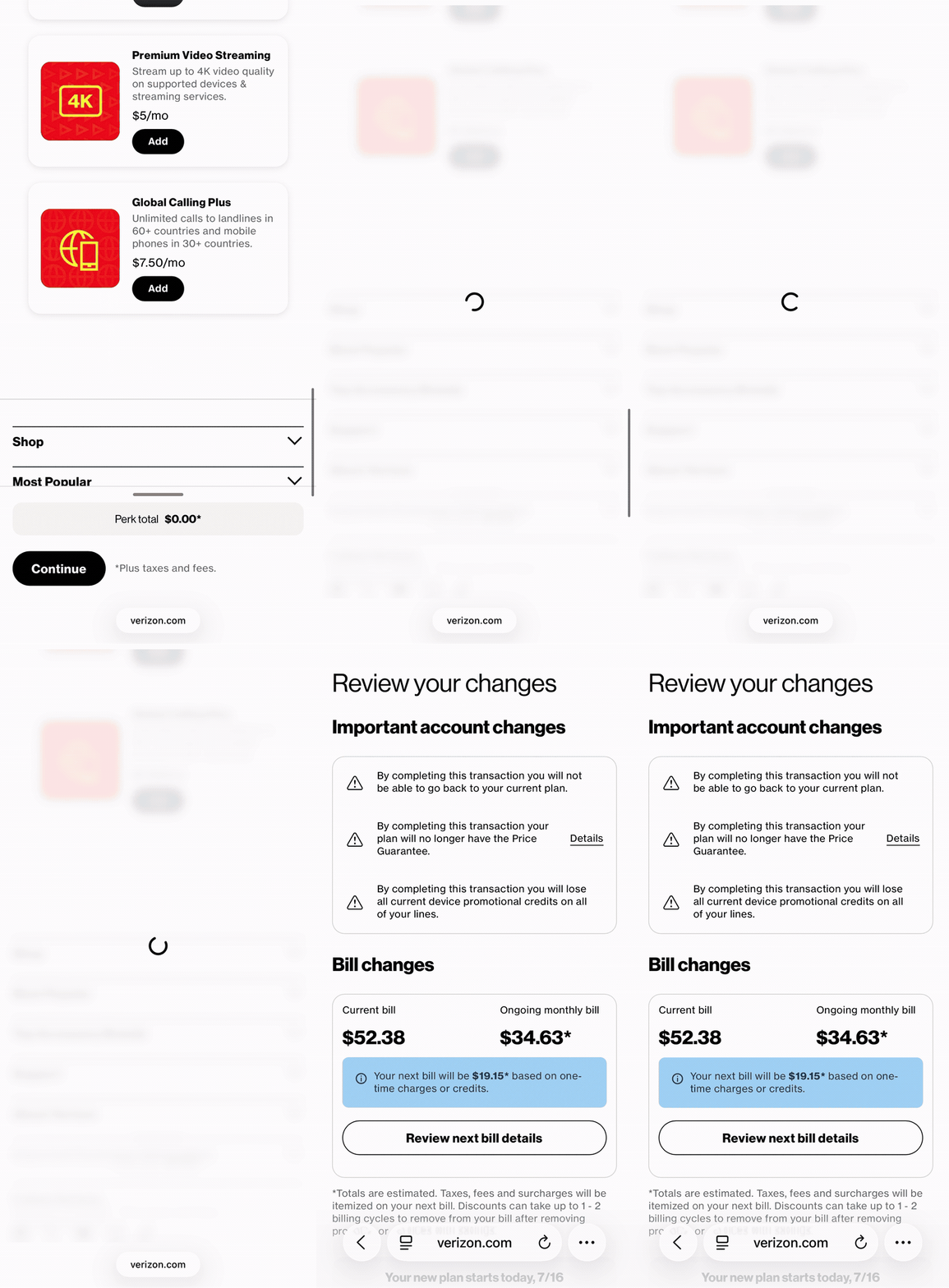
Line review
Key experiences

Plan management dashboard
Because the launch strategy wasn’t to actively drive customers to Simplicity, we kept the dashboard entry point intentionally minimal.

Plans page
Simplicity would exist alongside Verizon’s current myPlan offerings, so the treatment needed to promote it without positioning it as the primary plan option.
Explaining Simplicity and its account impact
I partnered with the design team responsible for the new-customer funnel to create a shared page and component that communicated Simplicity’s value consistently across acquisition and plan-change journeys.


On the switcher page, the primary challenge was helping customers understand how the change would affect their account. The experience surfaced what they would gain, what they could lose, and how their discounts or features would change.
Because perk bundles introduced new discount logic, the supporting backend systems were still being developed. Existing customers could also have perks and services that overlapped with a bundle. To manage that complexity, we defined three experience levels based on account configuration:
Low friction
Single-line accounts with no existing perks followed the simplest path. Because these customers would not lose any existing features or perks, we could merchandise standalone perks and bundles directly within the migration experience.
Medium friction
For two-line accounts with existing perks, we carried current perk selections into Simplicity without requiring customers to select them again. We limited merchandising to standalone perk offers and bundle-completer tiles when an account already had two of the three required services.
High friction
Accounts with three or more lines introduced greater complexity because every line had to migrate together and could have different perk configurations. We removed broader merchandising to keep the experience manageable, limiting actions to bundle completion and changes to existing perks.

Line Review
Research showed that bill impact was customers’ primary concern, so we reorganized the page to surface monthly cost changes before the order summary. We also highlighted account-level discount and feature changes and reduced the effective-date options from an unrestricted dropdown to two clear choices.
Order confirmation
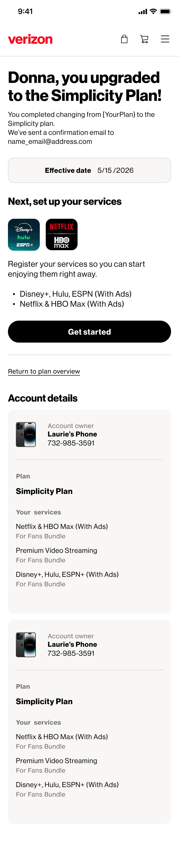
When bundle merchandising was removed from the migration flow, the confirmation page provided a secondary opportunity for customers to discover available bundles.
Outcome
151.7K
Monthly visits
21.9K
Completed orders
14.4%
Plan-to-order conversion
In its first month, Simplicity recorded 151.7K visits and 21.9K completed plan changes. Its 14.4% plan-page-to-order conversion rate outperformed the established myPlan journey by 1.3 percentage points.
Post-launch funnel analysis identified two major drop-off points: 75% between plan selection and line review, and 43.8% at final bill review. These findings informed an MVP2 effort focused on pricing transparency, including earlier explanations of taxes, fees, and prorated charges.
Reflection
Working within existing technical systems
The new plan structure required significant backend development, and engineering identified several features that could not be built within the launch timeline. I worked with the team to determine which requirements were essential to helping customers understand cost and feature changes, and where we could adapt existing components or defer merchandising.
Adapting the design as business rules evolved
Business rules continued to change after designs entered review. Because the experience used a component-based framework, I could update individual elements and account scenarios without redesigning the entire flow.