Role: Lead Experience Designer
Tools: Figma. JIRA, Agile

The accessory interstitial page is a bridge between the experience offering the business an opportunity to upsell customers with accessories.
As the Verizon brand transitioned into its latest iteration, the need emerged for the page to be redesigned - creating an opportunity for me to revisit the overall structure of the page.

The original interstitial page contained a basic site structure with the device or accessory they previously added from the product page and a CTA to continue if they were not interested in the upsell.
Following the item added - the original design leveraged the brands tab component and a customized product tile designed specifically for the interstitial page.
Since the tab component was the primary method of organizing the page - the business team sought to remove the tabs in favor of a better alternative.
With the iPhone being one of our top selling devices - we naturally looked to explore Apple's approach to their interstitial upsell.

A key takeaway the business team wanted to test was a similar waterfall approach with unique categories of accessories layered by row.
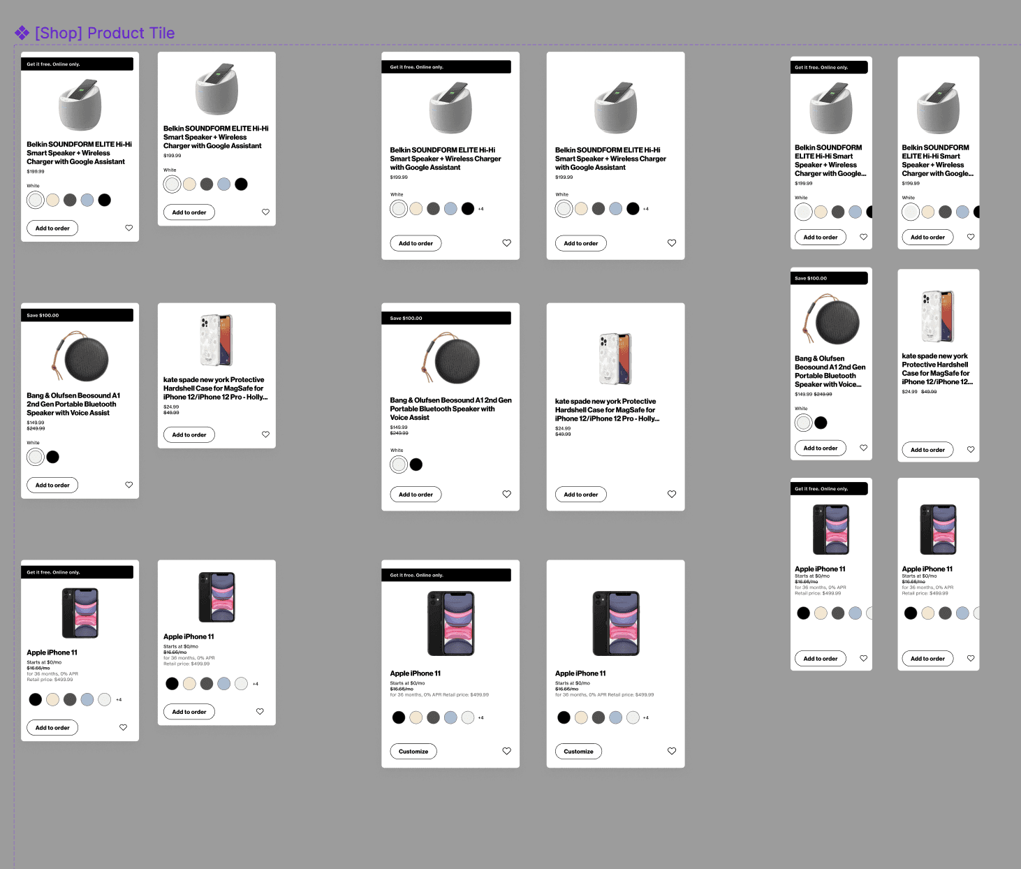
The product tile went through several iterations to reach compliance with the Design System team and ensure compliance with accessibility.

Some key considerations I needed to accommodate for within this tile component:
Long product names
Color swatches
Consistency with tile sizing
Odd product images
We stressed tested this designed for the edge case product.
Our preliminary design revolved around leveraging engaging copy to incentivize customers to add specific accessories to their cart. I partnered with our content strategist and brainstormed potential copy for each category of accessories.

In terms of visual updates - product tiles were to align with our latest design system elements and leverage a similar hierarchy to the product tiles on our grid wall page. On desktop, the primary call to action button was moved to the top right to guide customers to view accessories prior towards continuing to the next step.
After throttling this design into production for testing, we found that the new design increased conversions particularly on desktop while mobile declined slightly.
The drop in mobile attach rate seemed strange and we attributed the drop off to the high prominence of the continue button. In terms of hierarchy - customers likely pressed continue before reviewing the offerings on the page.
The drop in mobile attach rate seemed strange and we attributed the drop off to the high prominence of the continue button. In terms of hierarchy - customers likely pressed continue before reviewing the offerings on the page.
To streamline further designs that would leverage similar components within a shop experience, I created components which were added to the shop team's expansion pack.
The latest iteration is currently under testing via a throttle approach. Based upon findings there may need to be additional iterations.